Buffett Indicator
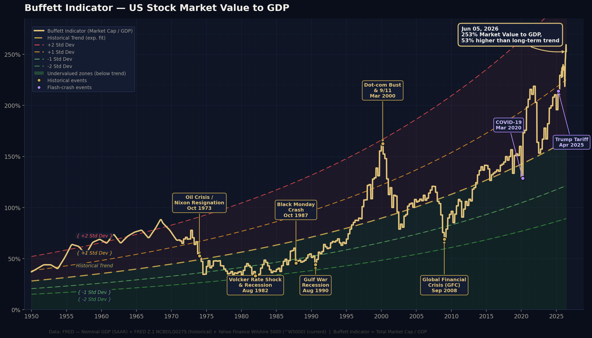
Latest data: —The Buffett Indicator compares the total value of the US stock market to the size of the US economy (GDP) — Warren Buffett's "single best measure of where valuations stand." Over the long run the market's worth should track economic output, so when prices race far ahead of GDP, stocks are expensive relative to the real economy and future returns have tended to be weaker; when the ratio sits low, the opposite has held.
How to read these three signals
The headline reading: total US market value divided by one year of GDP. At 100% the market is worth roughly a year of economic output; the further above 100%, the more richly the market is priced versus the real economy.
The absolute ratio has drifted upward for decades — lower interest rates, more overseas revenue in US-listed firms, and a heavier tech weighting all push it higher. So what matters more is how far today's reading sits above or below its own trend line. Positive means stretched versus history; negative means cheap.
A plain-language verdict — from "Undervalued" through "Fair Value" to "Significantly Overvalued" — based on how many standard deviations the ratio sits from trend. It turns the trend comparison into a single, at-a-glance label.
How to use it: treat it as a long-horizon context gauge, not a market-timing tool. Elevated readings can persist for years and don't signal an imminent crash — but they have historically pointed to weaker long-term returns, while low readings have preceded stronger ones. Use it to calibrate your expectations and position sizing, not to call the exact top or bottom.
Last updated: — · Latest data: — · Source: FRED (GDP + Wilshire 5000) · Not financial advice